Every AI Brand Looks the Same. Yours Doesn't Have To
Do me a favor. Open ten AI startup websites right now. I'll bet you money that at least seven of them have the same blue and purple gradient, some abstract shape that's supposed to be a neural network, and a headline about transforming something with AI. I see it every week. A founder comes to us with a genuinely impressive product, real technology, real customers, and a website that could belong to any of forty competitors. Cover the logo and you honestly cannot tell whose site it is. That used to be an embarrassing problem. In 2026 it's an expensive one. Buyer research this year found that around 60% of buyers are openly skeptical of AI products, and it's not because the tech is weak. It's because everyone sounds identical, everyone claims the same things, and nobody's proving anything. When buyers can't tell you apart from the company next to you, they compare on price. And you spend every sales call explaining yourself from zero.
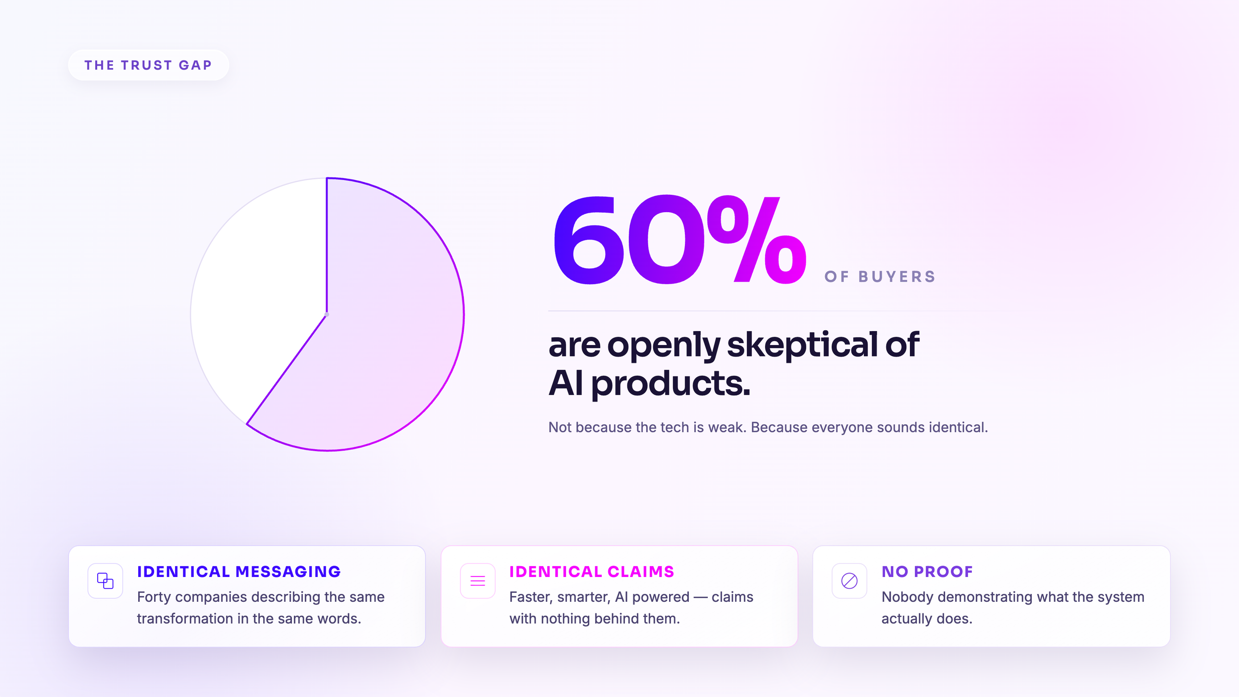
AI didn't kill differentiation. It just showed us who never had any.
Here's what actually happened over the last two years. AI made competent design basically free. A template that looks like decent agency work costs a few bucks a month and ships in an afternoon. So the bar for "looks professional" collapsed. Looking clean and modern isn't an advantage anymore. It's the cover charge.

And because these tools learn from patterns, they study what already exists and remix it, the more companies use the same tools with the same prompts, the more everyone converges on the same look. Everyone got faster at looking like everyone else.

Which means the thing that used to hide a weak strategy, which was polish, can't hide it anymore. Take away the gradients and the template and you're left with the only question that ever mattered: what makes your company impossible to confuse with anyone else?

That answer doesn't live in your color palette. It lives underneath it. We call it the invisible work, and it's literally why we named the studio Invisible Engine.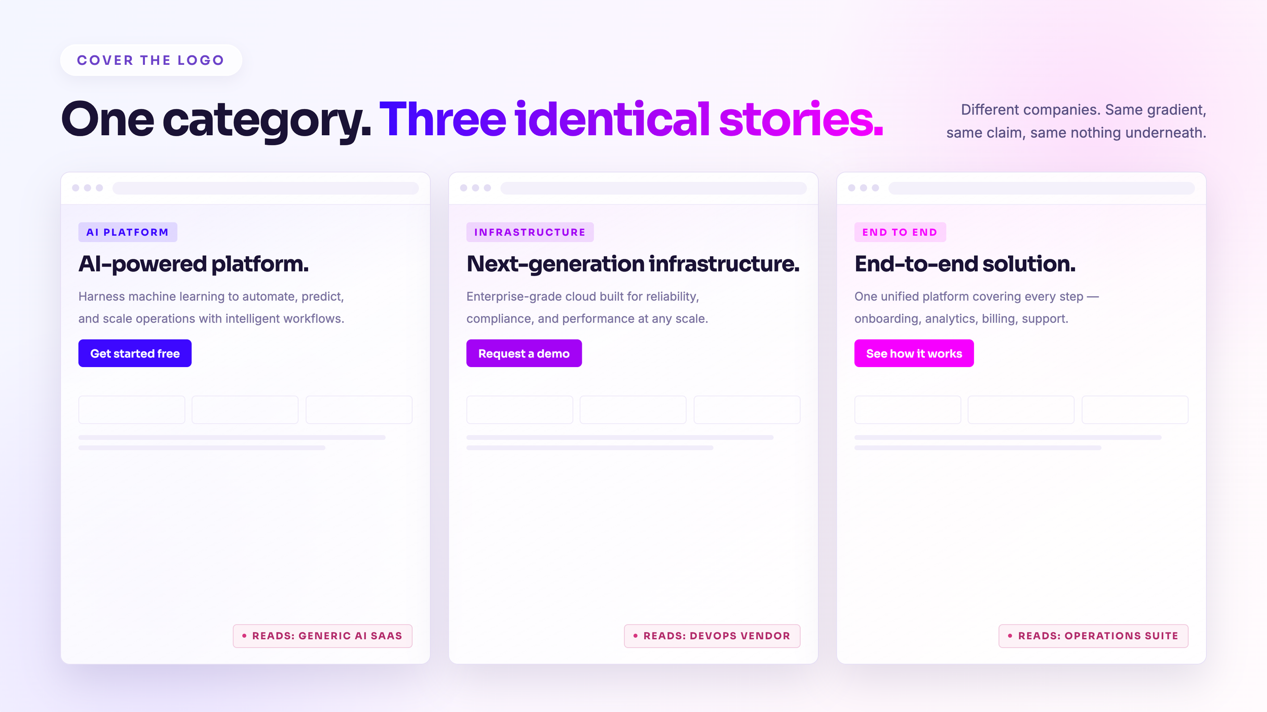
What the invisible work actually looks like
When a client starts a Brand Strategy engagement with us, we don't touch design for two weeks. Not a logo, not a moodboard, nothing. Two weeks of pure strategy: competitive analysis, brand archetype, positioning, mission, messaging pillars, naming, even trademark and URL research. You walk out with a full Strategy Playbook. That's the engine. Everything visual gets built on top of it.

Then design has something real to express. Our Brand Development sprint runs three to four weeks and produces your logo, your brand book, your fonts and colors and photography guidelines, the full kit. Because the strategy came first, the design isn't decoration. It's an argument. It says something no competitor could paste onto their own homepage.

Onboard, Discover, Shape, Amplify. That's the process. Most agencies stretch this same work across six months or more and charge two to five times what we do for it. We've done the industry comparison side by side and it's not close. We move fast on purpose, because the companies we work with, founders in AI, XR, energy, and defense, don't have two quarters to spend workshopping a mission statement while the market moves.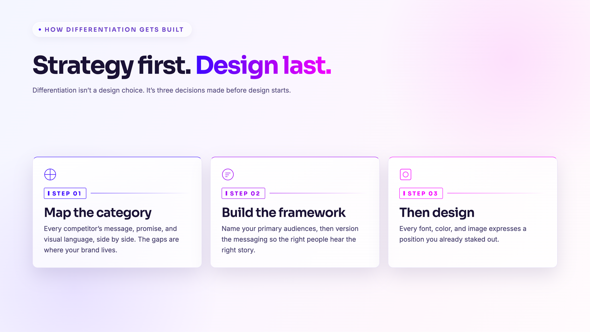
The brands winning right now are doing three things
**They sell the outcome, not the mechanism.** So many AI companies name themselves and message themselves around how the tech works, because the founders were closest to the tech when they started. A year later that identity is a liability. Buyers don't buy mechanisms. They buy outcomes. Fixing that story isn't cosmetic, it changes how fast deals close.

**They get specific.** The market is done being impressed by "AI powered." Buyers want to know exactly what your system does and why they should trust it. Vague transformation language reads as hiding something. Specificity reads as confidence.

**They move at an inflection point.** This is my favorite one. The most distinctive brands on earth are built on refusal. Refusing the category's clichés. Refusing to compete on a spec chart. When anyone can produce anything instantly, what you say no to becomes your signature.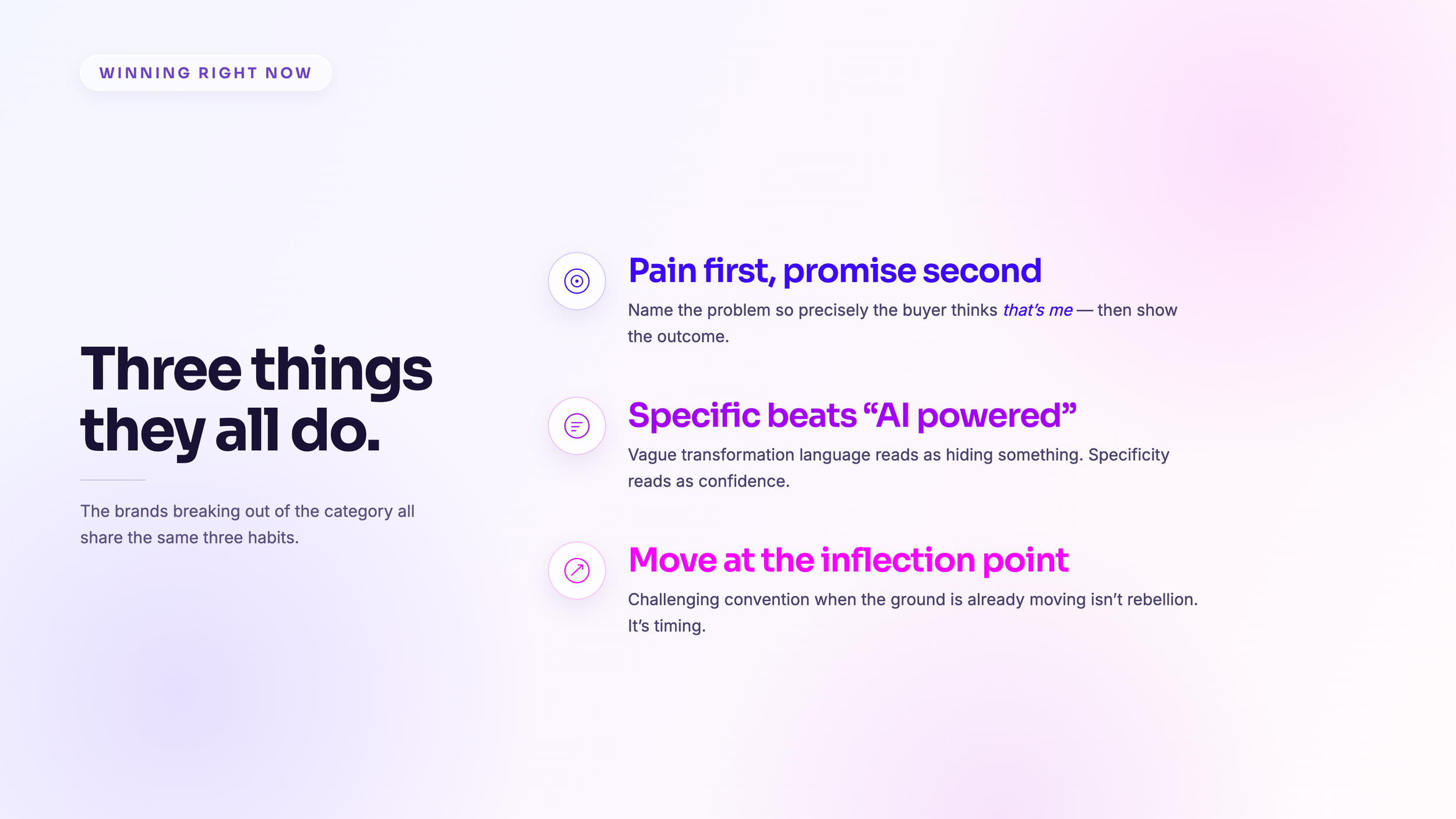
We're here for the guts, not the glory
That's not a tagline for us, it's a filter. The glory is the launch day, the shiny site, the applause. The guts are the positioning arguments, the naming exercises, the messaging that gets stress tested before anyone sees a pixel. We do the guts first, every single time, because that's what makes brands that don't just launch, they last.

So here's my challenge. Go to your homepage and cover your logo. If a competitor's name could sit there just as comfortably, you don't have a design problem. You have a strategy gap. And you can fix it in weeks, not quarters.

That's what we do. Come find us.

*Invisible Engine is the creative studio for future facing companies who need more than surface level design.