
The digital shift that turned a clinic into a category leader
the challenge
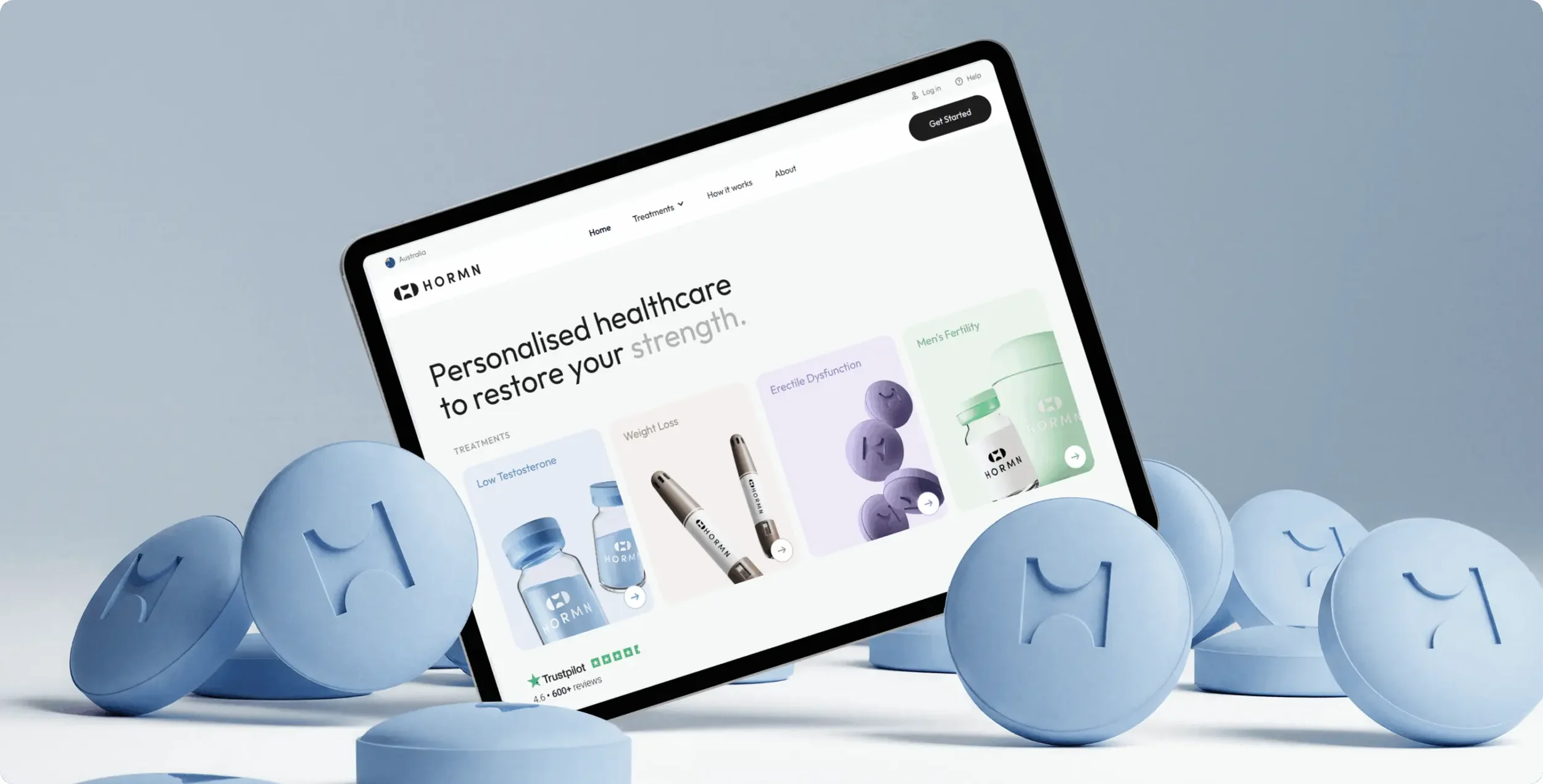
Before the redesign, HORMN’s online presence positioned the clinic as a single-treatment testosterone provider rather than a full men’s health platform. The original site created confusion about services, lacked a clear patient pathway, and forced users to piece together information across multiple sections.
Most men arrived at the site uncertain about their symptoms, unsure which treatment to explore, and without enough clarity to book a consultation. The digital experience also failed to reflect HORMN’s modern, science-driven brand or the level of care they deliver.
HORMN needed more than a new look. They needed a full restructuring of their brand narrative, their UX flow, and their digital decision-making experience.
the approach
-
Brand ad UX Strategy
Invisible Engine began by repositioning HORMN from a “testosterone treatment clinic” to a comprehensive men’s health provider. The strategy centered around increasing clarity, reducing user hesitation, and guiding men through an emotionally sensitive topic with confidence and support.
Key strategic decisions included:
Reorganized content architecture
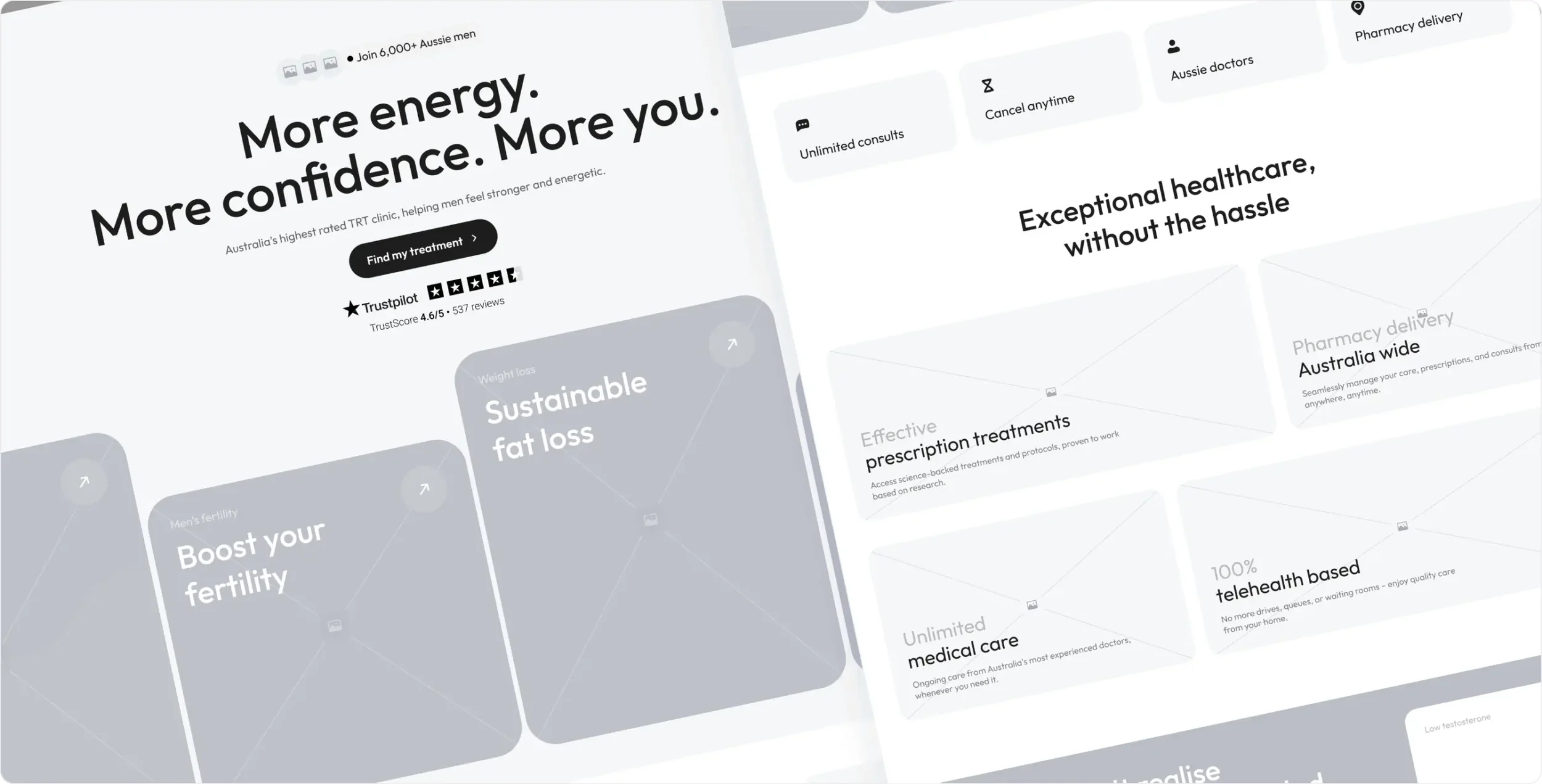
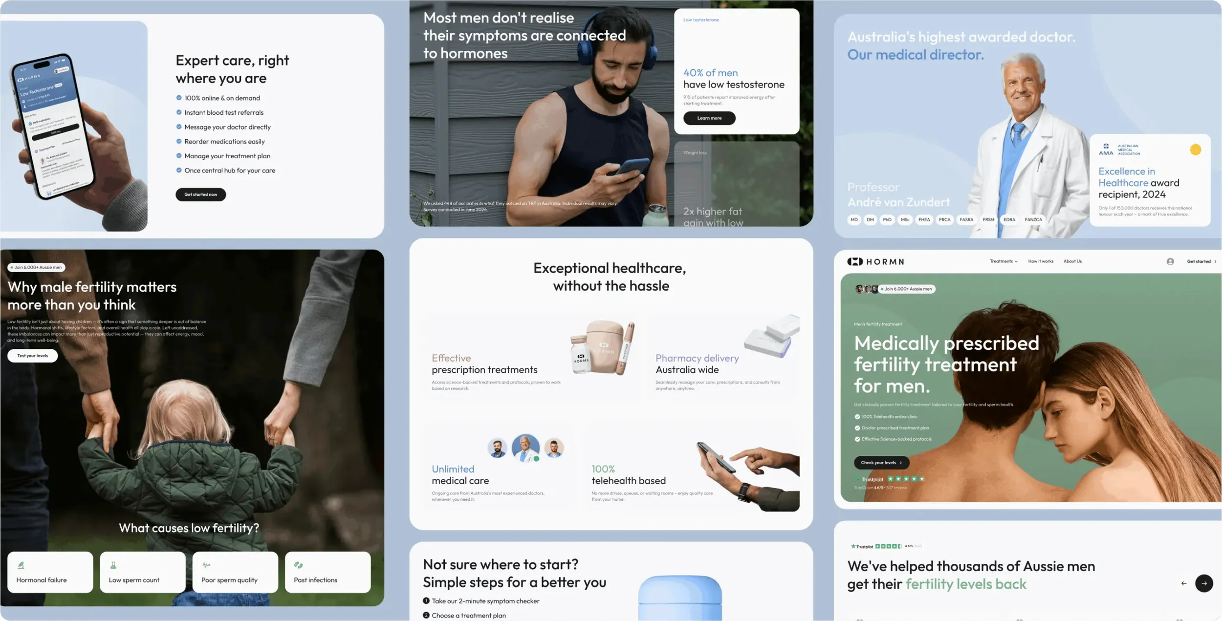
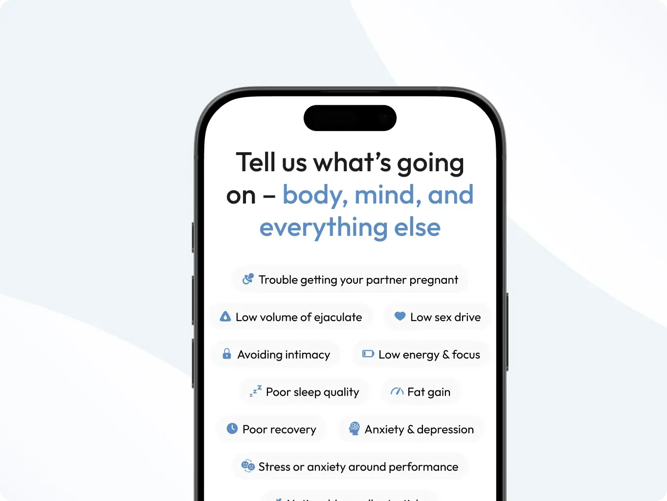
The site was rebuilt to clearly present the full range of services. Instead of one narrow path, users now see multiple treatment options and clear explanations that help them self-identify their needs.
Guided patient onboarding
A symptom-based quiz was introduced as the primary entry point. This gives users a simple way to understand their possible condition, receive tailored next steps, and transition naturally into consultation.
Transparent, empathetic communication
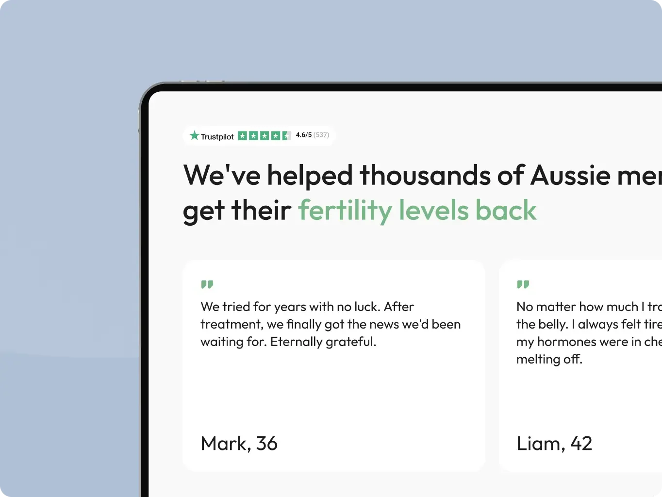
Content was rewritten to be direct, supportive, and easy to understand. The new tone makes the clinic feel more human, trustworthy, and modern.
-
Design
Updated visual identity
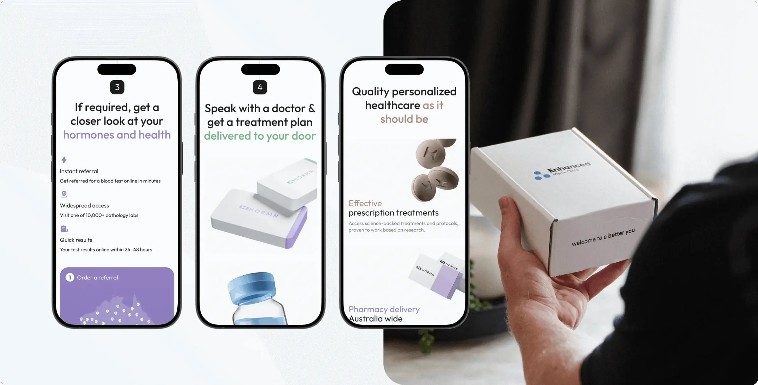
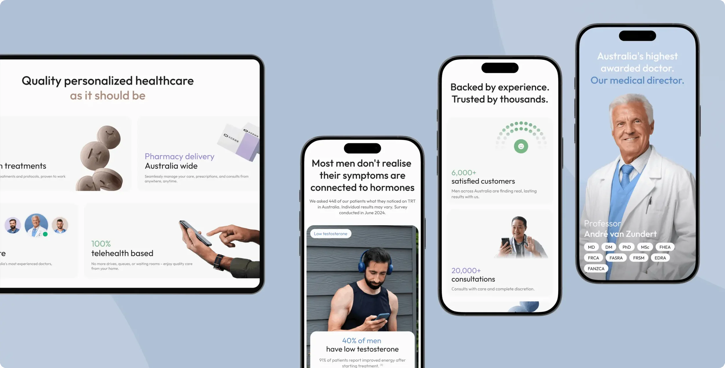
Invisible Engine refreshed the UI with clean structure, spacious layouts, and contemporary typography that signals professionalism and clinical credibility. The new design moves HORMN away from the outdated “clinic website” aesthetic and into the category of a digital health brand.
-
Development
Built for scale on Webflow
The new site was developed on Webflow, giving HORMN long-term flexibility, fast publishing, and the ability to easily expand into subscription plans, digital patient portals, and additional service lines.
Conversion-led interaction design
Primary calls to action direct users to the symptom quiz rather than pushing them immediately to book. This reduces friction and increases the likelihood that uncertain users continue through the funnel.
the outcome
-
HORMN now presents itself as a full-service men’s health clinic rather than a single-issue provider. The brand’s breadth and depth are clear, accessible, and confidently communicated.
-
The guided quiz and reorganized information architecture allow men to navigate sensitive health concerns without confusion or overwhelm. The new experience helps more visitors understand their symptoms and move toward care.
-
With a Webflow-based build and modular content structure, HORMN is now equipped to launch new services, add digital products, and evolve the brand as the clinic grows.
-
Built a cohesive design system from logo to pitch deck that signals precision, intelligence, and scalability, matching Numunon’s technological vision.


Brand Strategy
From competitive analysis to archetypes, we arm your brand with the clarity and conviction to cut through noise and move markets.
Design
Design isn’t decoration, it’s translation. We turn complex ideas into bold, magnetic systems that feel human, timeless, and impossible to ignore.
Development
We engineer digital experiences that move fast, scale hard, and make your brand unmistakable.

Video
Our films and motion work aren’t content, they’re catalysts. Stories built to spark, spread, and stick.
Ready to build something that lasts?
Let’s talk about how we can power your brand engine.